

Even as the current crisis recedes, offering quality content still remains a crucial way for businesses to attract and retain customers. According to a 2020 survey by the Content Marketing Institute (CMI), 72% of content professionals agree that their organization views content as a core business strategy.
Most of this new content will go online. So how do you do online content well? This blog series can help.
The biggest challenges in developing online content for consumers lay in meeting two goals:
- Capturing the consumers’ attention and trust so that they stay with your content
- Delivering the value they expect in the way they expect it (thus confirming their trust was well-founded)
The importance of the first goal obvious – if you don’t capture someone’s attention, you cannot convince them of anything. But you don’t have much time to capture their attention – just 3 seconds, according to Sarah Richards.
That second goal is a doozy. It represents the tipping – or tripping – point for blogger and formal communicator alike.
In this blog series, I’ll offer some tips on achieving both goals. In this post, I’ll explain how you can use the physical aspects your words, the text on the page, to accomplish the first goal and assist with the second goal.
The Obvious Thing – Know Your Audience
It’s not always obvious, I am guessing by the reactions I get sometimes, but before you put fingertips to keyboard, you need to understand for whom you are writing and why – in other words, know your audience. The word choices you make, the data you include, the design you implement, and the tags/metadata you choose are driven by what you know about your audience’s needs, expectations, and habits.
Above all, consider what kind of constraints your audience might have.
Much has been written elsewhere about researching your audience. I even wrote a blog post myself about capturing audience research: “Tips for Developing a ‘Real’ User Profile for a Content Strategy.” Suffice to say that having some manifestation of that research in front of you – whether you simply make a list or create a more extensive user persona – will help you develop the best content product you can.
Above all, consider what kind of constraints your audience might have. For example, if your audience includes executives, consider creating succinct, straight-forward content. Executives are notoriously short on time, so providing them with a high-level summary of your main points can motivate them to bookmark your page and even pass along a link to others.
Some additional audiences whose needs, expectations, and habits you should consider include new or novice customers, decision-makers at the middle management level, technical customers/partners such as service providers, and, of course, potential customers.
In the large scheme of things, the key is to tailor – and layer – your content in a way that best appeals to your mix of audiences.
Now let’s talk about the smaller scheme – the visual appearance in an online format of a single piece of content.
The Big Thing – Scannability
One of the biggest considerations for online content is scannability. Yes, I know that scannability is not defined in any dictionary. (However, scannable is there!) What I mean by scannability is the ability of the reader to easily engage with the words on the screen or page.
In other words, visual barriers to the reader have been consciously removed from the piece of content.
Write for the skim readers….they are likely 79% of your audience.
Some experts lump this idea into the concept of “readability” But readability – defined as the ease with which a reader can understand written text – is a vast idea that includes word choice, sentence length, grammar, and similar concerns. Scannability probably falls where readability, accessibility, and content design intersect.
To be scannable, the content must appeal to what Ross Simmonds (@TheCoolestCool) calls “the skim reader.” In a June 16, 2021, Twitter post, Simmonds describes skim readers as the people who “will skim right over” the text within a paragraph and “just digest the first line.” Foundational research shows that they are likely 79% of your audience. Write for the skim readers as well as for the audience (like your family!) who will read every word.
A word of caution here before I go into more detail: If your content will appear on a webpage or within an app, you have only so much control over its appearance. The CSS or formatting defaults in the platform will control font, font size, font color, and even the frame size of your media.
But don’t despair, you can and should control many of your content’s visual aspects.
Techniques for Scannability
Controlling your content’s visual aspects – irrespective of the CSS or platform – means, in part, controlling the space and shape of your text. But why bother?
Relentless multi-sentence paragraphs in an unbroken stream down the page is more than boring; it’s visually intimidating. Below is a graphical rendition of how most people view such a page (online or in print).
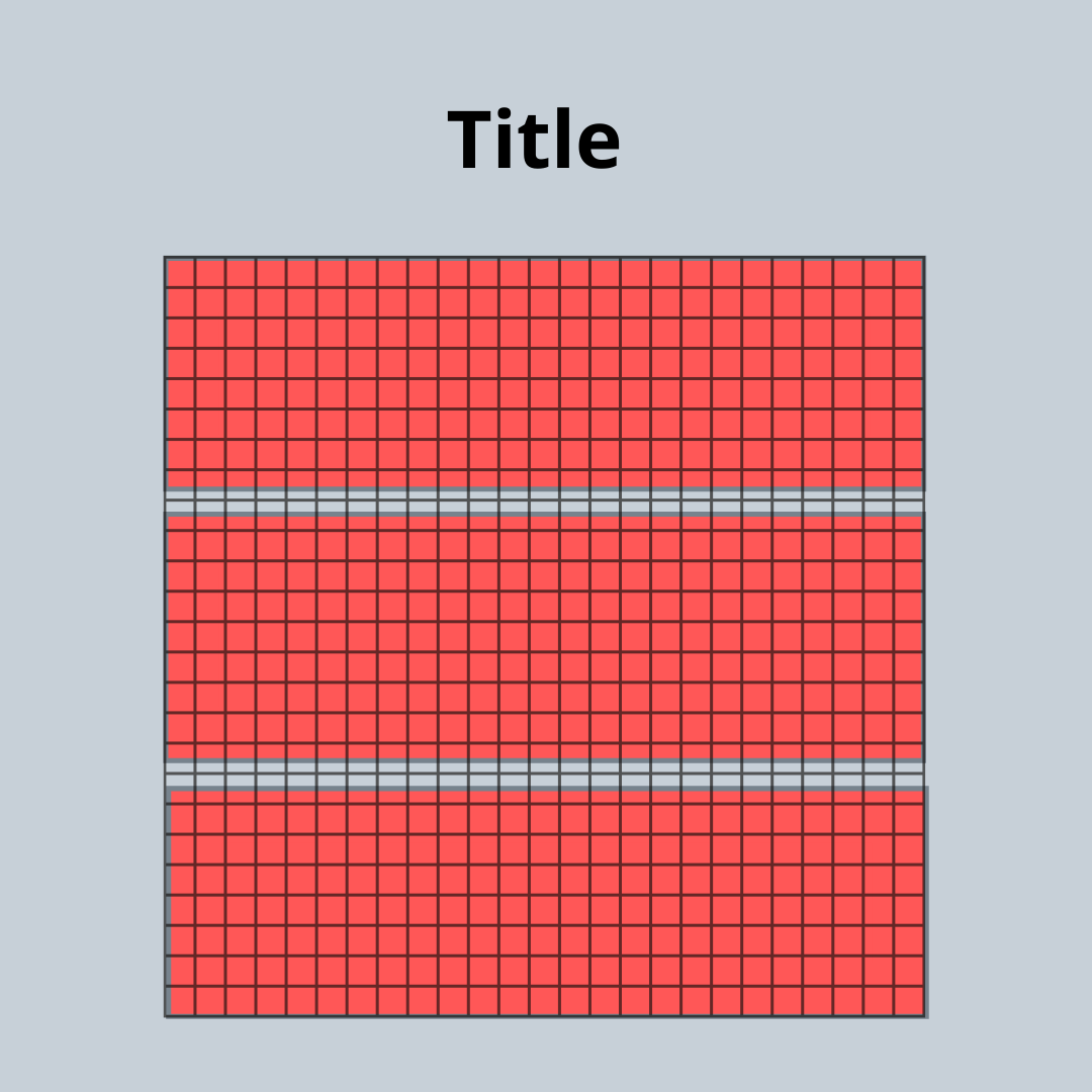
It’s box after impenetrable box – without relief. In fact, studies have shown that the eye seeks relief when a page looks like this.
How best to provide that relief? Here are some tips.
Use Headings and Subheadings
Adding headings and subheadings breaks your content into more digestible chunks, giving the reader a contemplation point before they move on.
Headings also serve as signposts for the skim reader. If your audience is short on time (or multi-tasking), meaningful headings – headings that capture the essence of your main points – can motivate them to bookmark your content for a return trip.
Always always use the hierarchy of headings that are available in your editing tool, CMS, or WYSIWYG interface. Doing so ensures consistency within the content piece and across your content set. It also helps your content “travel well” from browser to browser and device to device.
Vary Paragraph Length
While a lot can be said for practicing consistency, especially when describing highly technical products, the practice does not apply to paragraph length in online content. Generally, online paragraphs should be short – no more than three sentences.
Generally, online paragraphs should be short – no more than three sentences.
But the key is to vary your paragraph length. (The same applies for sentence length, but that’s a story for another time.) One-sentence paragraphs are fair game online. Weaving them between longer paragraphs gives your content cadence that busts out of the boxy text mold.
Plus you can use one-sentence paragraphs to emphasize an important point.
Include Lists
Including lists is another way to bust the boxy text mold. Lists let you organize succinct, related thoughts or instructions in an easy-to-scan way. The key concept is succinct. No one wants to read a list item that is as long as a paragraph. The reader can too easily lose the context of the list.
In the same vein, do not use lists to organize a hierarchy of thoughts. A system of headings and subheadings will better serve your outline of concepts than a list.
Not sure which type of list to use? Choose a bulleted list if the order of the list items doesn’t matter. Choose a numbered list if the items’ order or rank matters.
How you put together the pieces of a list depends on your preferred style guide. The pieces always include:
- A lead-in (complete sentence or not), followed by a colon
- List items that:
- Carry the same “weight” or importance
- Are grammatically parallel
- Are punctuated the same
Use Tables (Sparingly)
Tables are useful to delineate more than one characteristic of each item in a set of similar or related items. In that way, they are like a super-list. They help the reader quickly absorb salient points and differentiate nuances and complexities.
That’s also the reason to use them sparingly within a piece of content. Tables that are wider than three columns don’t travel well – to mobile phones, for instance. And coding them for multiple devices is tricky.
Using simple tables can break up a longer flow of text – and thus they serve as visual relief on the page. But they also help you avoid writing wordy sentences to explain characteristics and relationships more easily shown in tabular format.
When including a table, ensure that you introduce it with text that explains its purpose and, if necessary, its format. Also ensure that column headings are clear as well as concise.
Incorporate Emphasis
Emphasis is the online equivalent of using bold or italics to draw attention to an important word or phrase. Your CSS interprets an <emphasis> tag by adding the appropriate formatting (bold, italics, larger font, special font color, or some combination).
Emphasis becomes especially useful when you are introducing a new term or concept. You’ll also want to use emphasis to ensure that readers see the word “not” on the page.
But do not overuse emphasis in a piece of content. Overuse can confuse the reader’s eye as it searches for the most important concept out of many.
Add Pull-Quotes
If you want a point to stick with a reader, include it in a pull-quote somewhere on the page. Often a reader’s eye is drawn first to either the graphic(s) within your content or the pull-quote(s). So make them count.
Pull-quotes are especially useful to bloggers who promote their posts on social media. You are basically providing your social media followers with “Tweetable” content.
Pull-quotes are especially useful to bloggers who promote their posts on social media. You are basically providing your social media followers with “Tweetable” content.
One note about pull-quotes: If you are pulling in a quotation written or said by someone else, be sure to clearly attribute the quotation to that person. Give their full name and title and, if possible, include the title of quoted work.
Include Images/Videos
Media elements such as images and videos can provide can provide depth, breadth, and even a personal touch to your content. They are often the first thing on the page that your skim reader sees and often the biggest take-away for most readers.
Whole books have been written about the appropriate design and use of graphics and video inside or alongside of a piece of content. Please consult them.
Avoid using images and other graphical elements just to “pretty up” a page. Or for the sole purpose of breaking up a long piece of text.
Suffice to say that inclusion of media in content should always serve a purpose. Avoid using images and other graphical elements just to “pretty up” a page. Or for the sole purpose of breaking up a long piece of text.
As with tables, introduce the graphical element and highlight anything you want your readers to attend to as they view it. Also, as with tables, watch the online framing so that the media doesn’t get truncated on the page.
When you are including videos, ensure that you properly embed them in the text (typically by using the “embed” option within the “insert media” function in your editing tool). Both YouTube and Vimeo provide embed code through their “Share” menus, and you can easily copy and paste that code. But your editing tool or CMS might require different framing than what is included in the code, so be mindful of that. (When in doubt, ask your friendly information architect or webmaster!)
Also note that some website analytics tools require use of a certain flavor of online video player so that watch times and percentages can be monitored. I only know enough about that to be dangerous, so I won’t comment further. (Feel free to offer advice in the comments section of this blog post!)
Consider Accordions
My favorite information architect used to refer to text accordions as “twisties.” (I miss you, buddy!) They are the little arrows next to a title or other significant signpost in online content that let the reader show or hide the content that immediately follows.
Accordions empower readers to hide details they don’t need to see to grasp the point of your content. They are useful for experienced consumers and audiences who return to your content over and over, and they empower those skim readers.
However, coding accordions can be tricky, and they can make your webpage load more slowly. Don’t overdo it and don’t over-rely on them. Use of accordions should never be a substitute for good content design and planning.
But Don’t Overdo
The words “don’t overdo it” actually apply to the whole set of tips that I have offered here. Not every piece of content has to have all of these visual elements (but yes to headings!). Combining some of them in a single piece of content should improve the content’s scannability. But just as you don’t want an impenetrable wall of four-inch paragraphs, you also don’t want your content to look like a three-ring circus.
Related Considerations
Before I wind up, I want to mention a couple of additional concepts you should consider about the presentation of your content online.
A Word About Article Length
Part of the physicality of a piece of content is its length. There is no denying that.
Much discussion has occurred recently about the ideal length of an online article or blog post. Prompting some of this discussion was a recent decision by Google to update its search algorithm to prefer content that is around 2000 words in length. Huh.
Piling onto that is the new “service” some social media and blogging platforms have recently added that tells consumers how many minutes an article or post will take to read. So some folks have been advising writers to keep their online content to a three-to-seven-minute reading time.
Your blog post, webpage, or online article should be as long as it has to be to meet your audiences’ needs – and no longer.
I am here to say that I have no idea where these numbers and this advice comes from. Your blog post, webpage, or online article should be as long as it has to be to meet your audiences’ needs – and no longer. Again, good content design, effective content strategy, and thoughtful planning should be the drivers of your content’s length. Not the latest fad.
A Word About Accessibility
To underscore where I started in this post, knowing your audience also means understanding their accessibility needs. Website accessibility is another huge topic, and even has its own standards body. If your company is serious about online content, you should understand these standards and put them into practice.
Here are my two favorite pieces of advice in the area of accessibility:
- Always always add alternative text to your tables and images. Screen reading tools used by visually impaired folks rely on effective alternative text to make their online experience meaningful.
- As much as is feasible, include captioning in your videos. Captioning enables hearing-impaired folks to get the most out of a viewing experience. (I understand that Zoom will soon offer a closed-caption feature, too.)
To conclude, I encourage you to visit the Resources page on this website and explore the many fine writing guides, dictionaries, and helpful websites listed there.
Here are other posts in the blog series:
- Writing for Relevance: https://dkconsultingcolorado.com/2021/07/27/creating-online-content-for-your-customers-relevance/
- Writing for Clarity: https://dkconsultingcolorado.com/2021/09/07/creating-online-content-for-your-customers-clarity/
- Writing for Accuracy: https://dkconsultingcolorado.com/2021/10/26/creating-online-content-for-customers-accuracy/
Discover more from DK Consulting of Colorado
Subscribe to get the latest posts sent to your email.

8 thoughts on “Creating Online Content for Your Customers: Scannability”